The brief
A food brand with a growing range has a choice to make early: design each pack as it comes, or design a system once and apply it. The first is cheaper for one SKU and expensive by the tenth, when nothing on the shelf looks related. IGM Food needed the second — a label that would carry makhana, dry fruits and snack mixes, in glass jars and in pouches, without being redrawn every time a flavour was added.
What we built
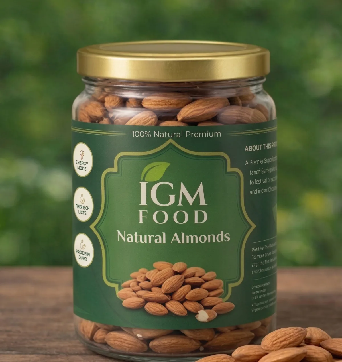
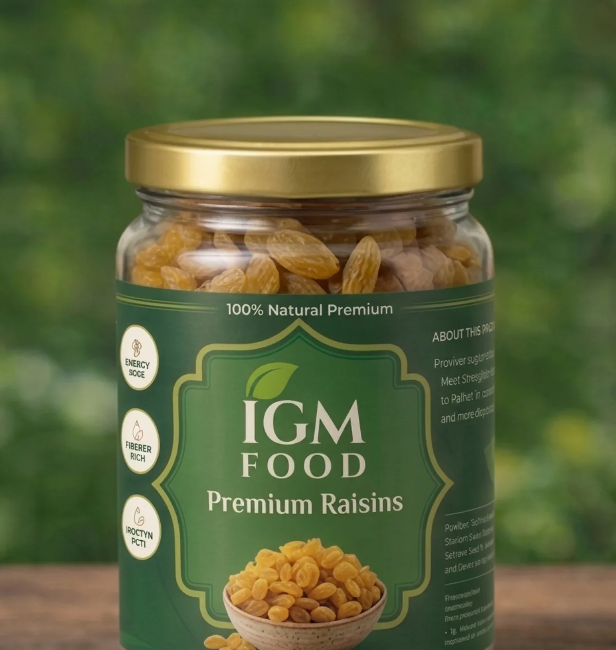
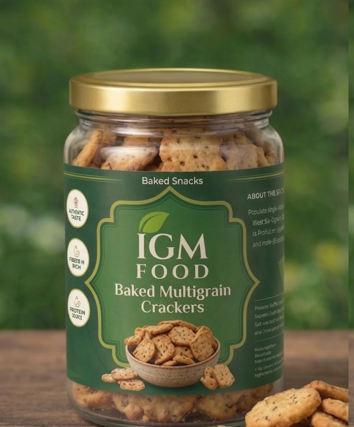
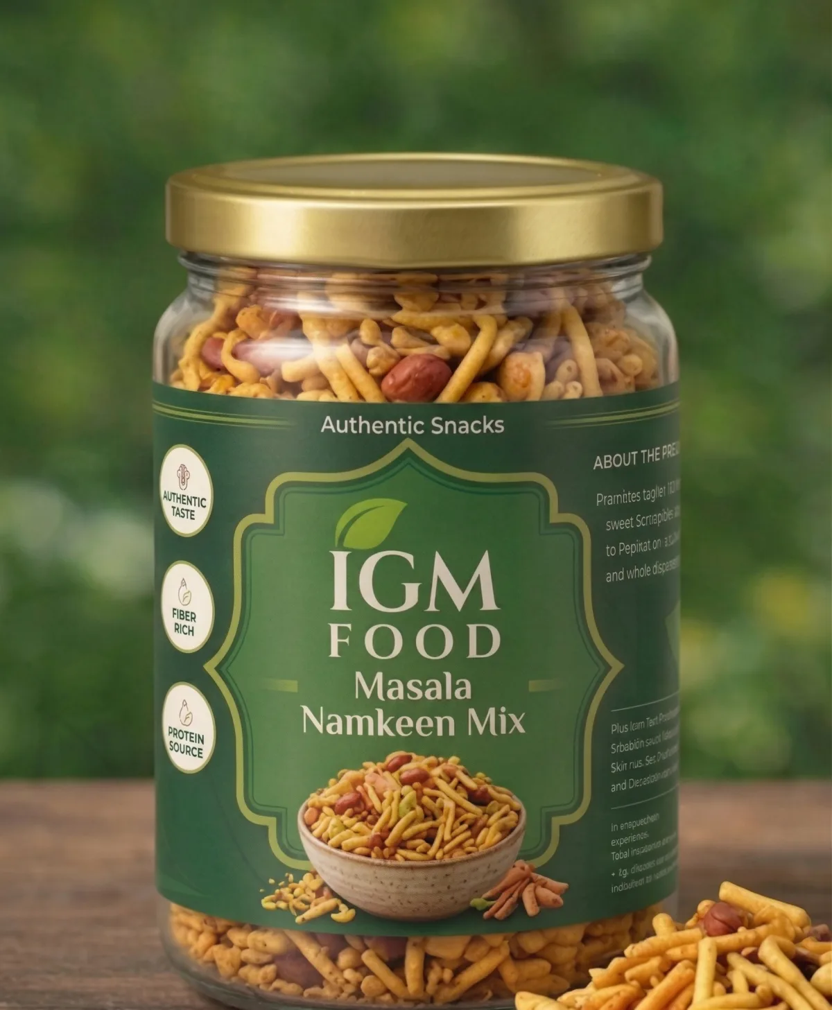
A panel system, not a one-off label
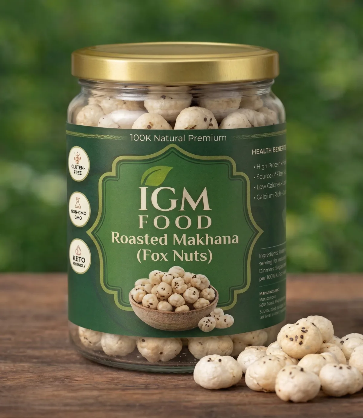
Fixed zones for the brand block, the product name, the health badges, the about-the-product panel and the declarations. Once those positions were settled, every new SKU became a fill-in rather than a fresh design.
Flavour and category variants
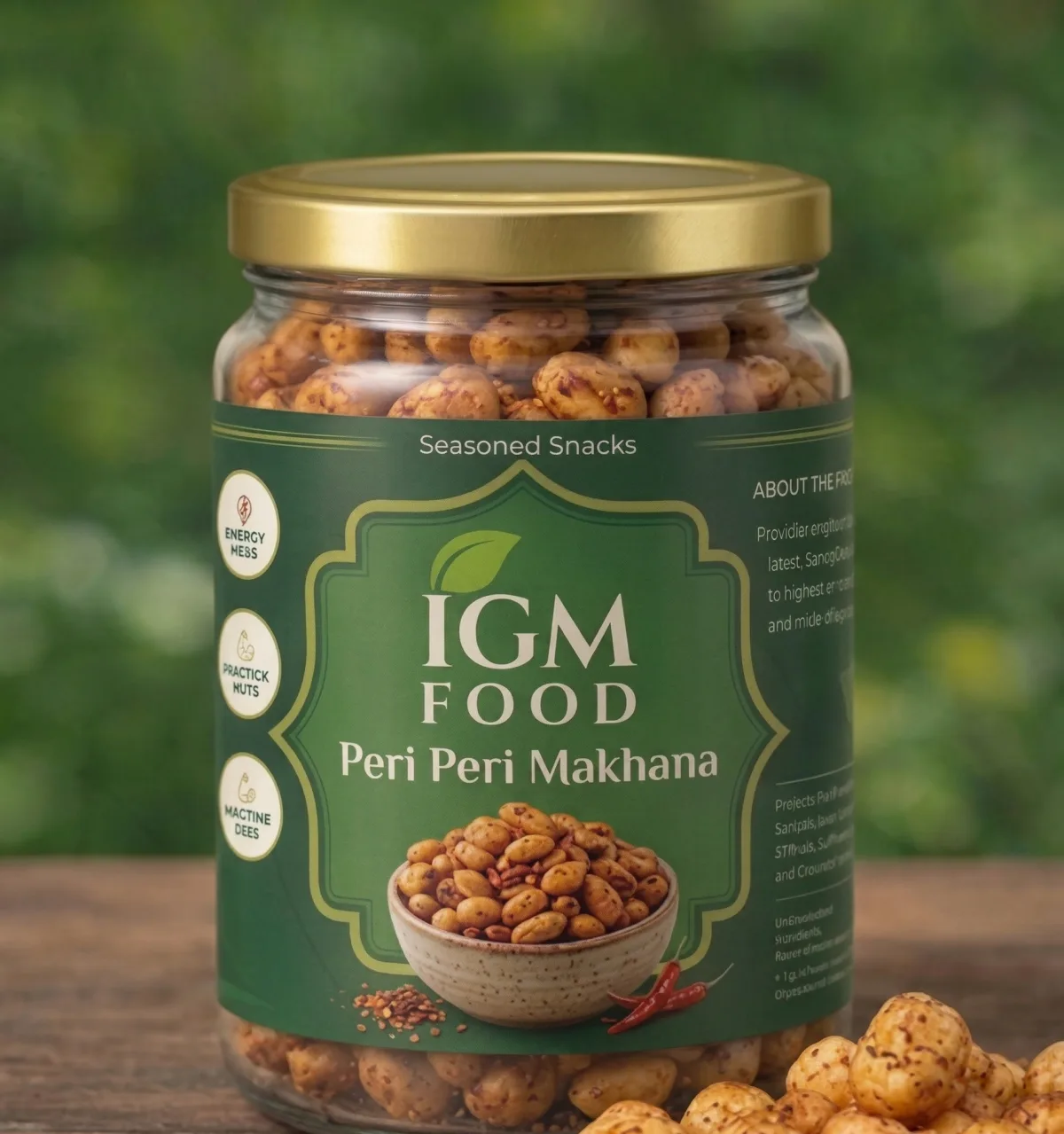
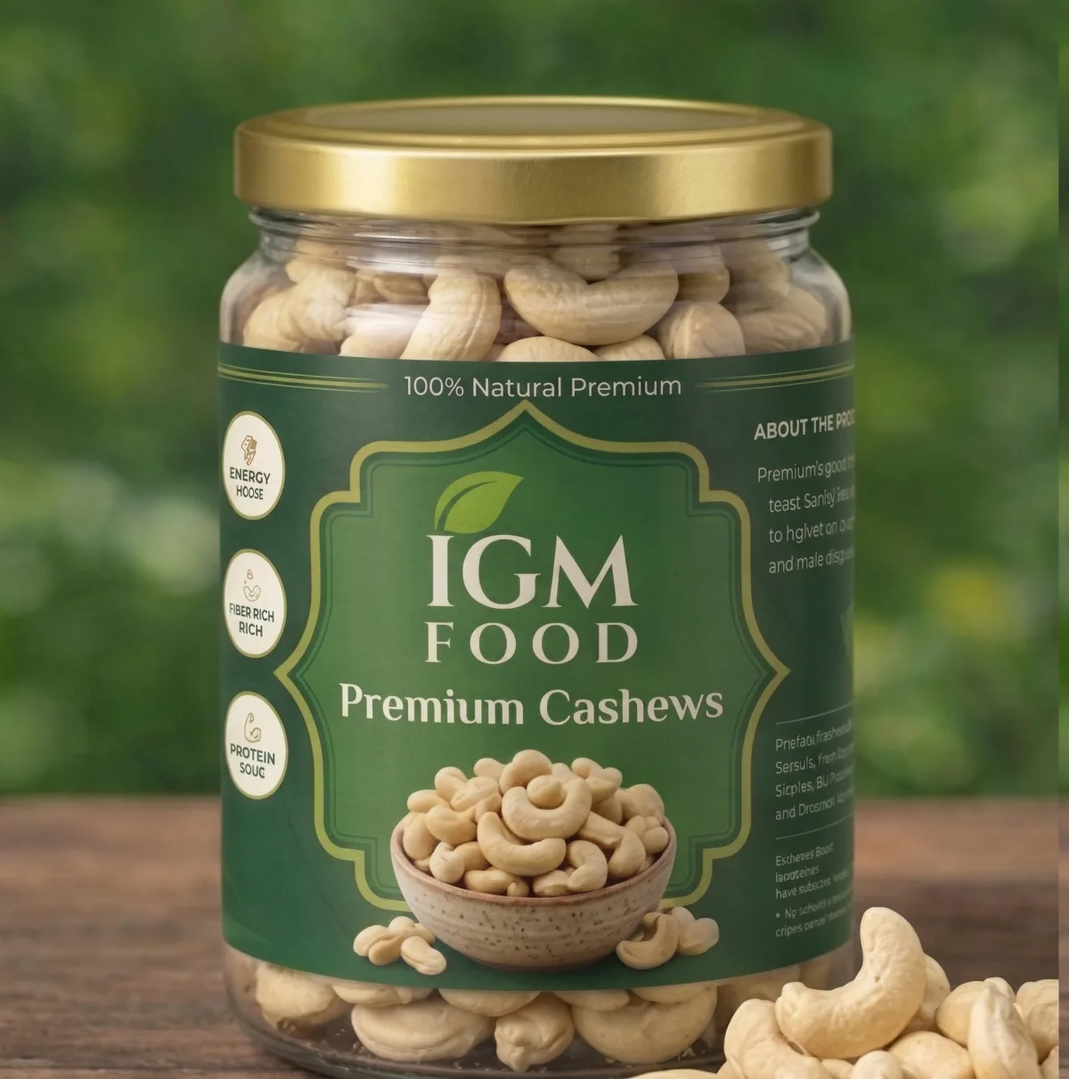
Roasted and peri peri makhana, cashews, almonds, raisins, multigrain and mixes — each distinct enough to pick out on a shelf and close enough to read as one brand.
Jars and pouches, 200g and 500g
Pouch artwork laid out per size rather than scaled: the same label at 200g and 500g needs different proportions to keep the name readable and the declarations legal at print size.
Print-ready artwork
Bleed, dielines and the declaration panel — FSSAI details, nutrition, ingredients, net quantity and the veg mark — placed to the sizes the rules require, handed over in the formats the printer asked for.
The range
Where it stands today
The label system is running across the IGM Food range in jars and pouches, and the packs are what the brand's website and marketplace listings are built around.